Showing posts with label contrast. Show all posts

Sunday, March 25, 2012

Tilt-Shift Effect Photoshop

Hey guys! 

Recently, I have been experimenting with image editing through Photoshop and have found a way to replicate the tilt shift effect produced by extremely costly DSLR lenses. Here is a sample image taken by myself:

 Original Image
Edited Image

By having a lens blur gradient, we can focus on the target object, blurring out those in the background. This is the basis of a tilt shift lens. To intensify the effect, the contrast of the picture can be edited to give it a more miniature look. This is my first few experiments so it has not been perfected!

Thursday, March 8, 2012

Image Editing in Photoshop

Hi guys,

I'm finally back! This post will be dedicated to showing that photos with low megapixel counts can still look great through the wonders of Photoshop!

Original photo: This photo was rather boring due to the lack of sharp contrasts and rather simple composition. Hence, to remedy this, we could either give it an artistic touch or use more intense colors.

 Artistic photo: This simplifies the colors even more while creating an artistic effect. Note that although a lot of detailing of the background was removed, crucial details such as the branding and "L" indicator are there.
 Intense colors: By intensifying the background, the composition of the picture becomes more balanced due to the emphasis on texture. However, we lose some detailing on the subject to improve composition.
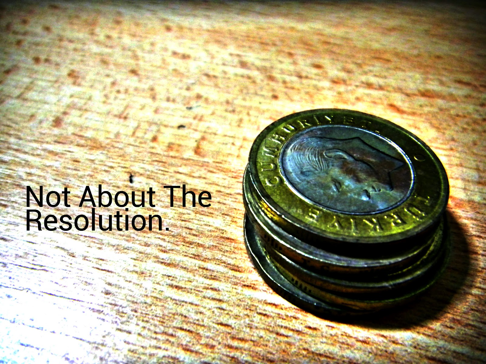
Original Photo: The colors in this photo are extremely muted due to the camera's compensation for background lighting. This causes the image to be dull an unappealing.
 Intense Colors: By intensifying the overall colors of the photos, we achieve the effect of filling up space. The detailing on the coins also become apparent through the increased contrast, making it more visually pleasing.
 Original Photo: This photo is rather neutral on the coloring and it composition is rather decent with most of the space filled. However, the viewer will lack a point to pay attention to. Hence, added blurring is needed.
Edited Photo: Firstly, I removed the shadow on the top of the picture which draws attention away from the subject. Next, I blurred out the surroundings of the brand label to increase the focus there. Finally, the colors were modified slightly for a more intense effect.

Saturday, September 3, 2011

Class Jersey Design

Hey guys! Just thought I will share my class jersey design for those who don't have Facebook. Basically, it is rather simple to recreate in Photoshop and comprises a set of checkers at the top, tilted at an angle. The bottom is faded using a black to transparent gradient layered over the checkers and is rather steep so that not too much will be cut off. If you can see the details, the lower squares are all brushed to give it a more modern effect. The main text is also slanted at an angle with the checkers. However, the school name is put horizontally to control the general flow. Otherwise, the shirt will look slanted when worn as the tilt is rather subtle. The back adopts a regular jersey design with the name and number of the wearer. However, the orange-black-white theme is preserved to ensure that the back matches the front. Orange was chosen as it stands out from the green on the field while black is the main color as it is not too distracting. Look out for more variations of this design after I update this post! Thanks for viewing!