Showing posts with label photoshop. Show all posts

Sunday, March 25, 2012

Tilt-Shift Effect Photoshop

Hey guys! 

Recently, I have been experimenting with image editing through Photoshop and have found a way to replicate the tilt shift effect produced by extremely costly DSLR lenses. Here is a sample image taken by myself:

 Original Image
Edited Image

By having a lens blur gradient, we can focus on the target object, blurring out those in the background. This is the basis of a tilt shift lens. To intensify the effect, the contrast of the picture can be edited to give it a more miniature look. This is my first few experiments so it has not been perfected!

Thursday, March 8, 2012

Image Editing in Photoshop

Hi guys,

I'm finally back! This post will be dedicated to showing that photos with low megapixel counts can still look great through the wonders of Photoshop!

Original photo: This photo was rather boring due to the lack of sharp contrasts and rather simple composition. Hence, to remedy this, we could either give it an artistic touch or use more intense colors.

 Artistic photo: This simplifies the colors even more while creating an artistic effect. Note that although a lot of detailing of the background was removed, crucial details such as the branding and "L" indicator are there.
 Intense colors: By intensifying the background, the composition of the picture becomes more balanced due to the emphasis on texture. However, we lose some detailing on the subject to improve composition.
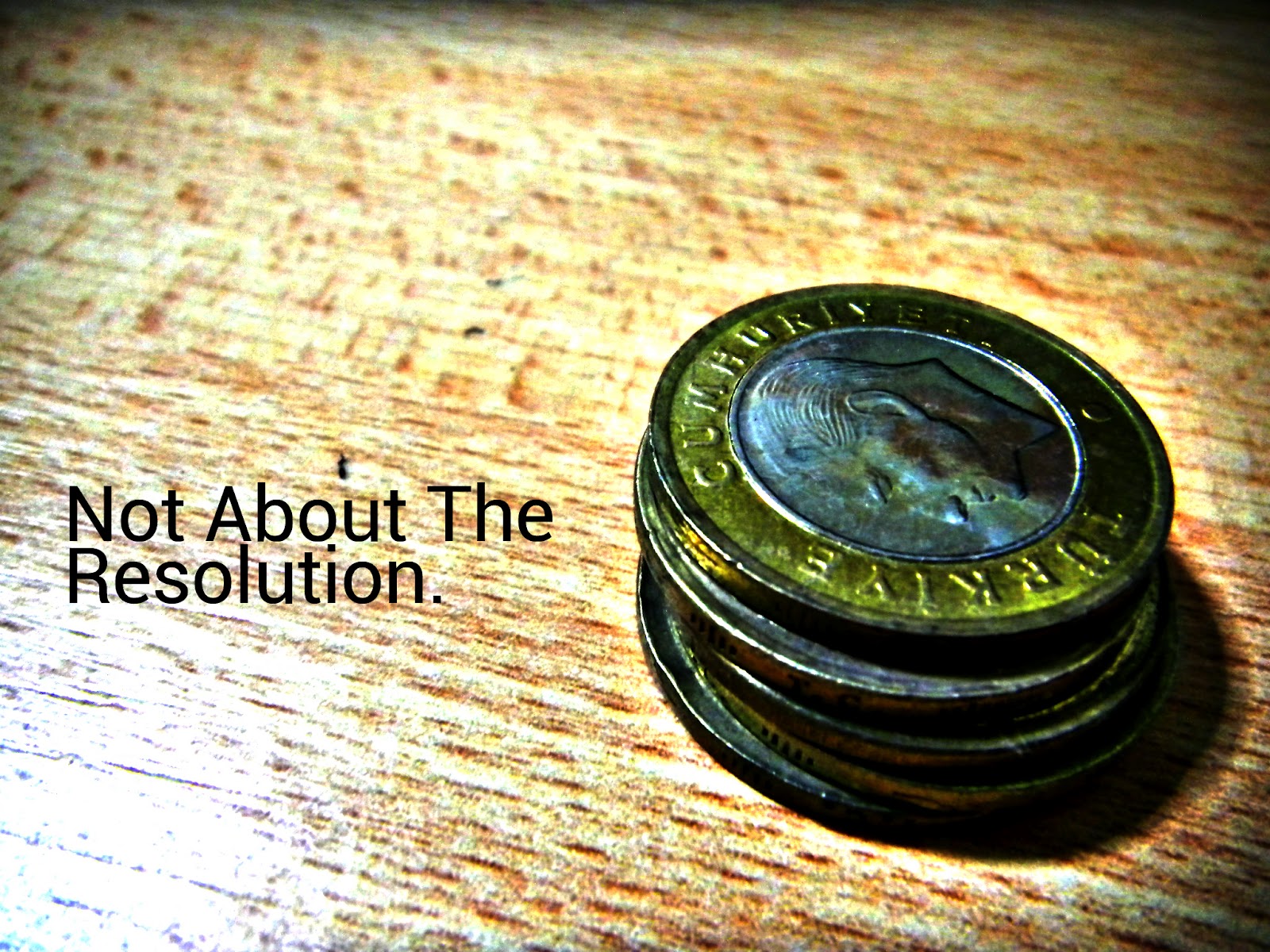
Original Photo: The colors in this photo are extremely muted due to the camera's compensation for background lighting. This causes the image to be dull an unappealing.
 Intense Colors: By intensifying the overall colors of the photos, we achieve the effect of filling up space. The detailing on the coins also become apparent through the increased contrast, making it more visually pleasing.
 Original Photo: This photo is rather neutral on the coloring and it composition is rather decent with most of the space filled. However, the viewer will lack a point to pay attention to. Hence, added blurring is needed.
Edited Photo: Firstly, I removed the shadow on the top of the picture which draws attention away from the subject. Next, I blurred out the surroundings of the brand label to increase the focus there. Finally, the colors were modified slightly for a more intense effect.

Tuesday, November 8, 2011

[App UI Mockup] Announcements

Emails, Facebook, SMS inefficient in spreading announcements? Capitalise on your smart phone by utilising a dedicated application to send announcements whether for your work or social purposes!

*Important Notice* This is a draft.

This user interface was specifically designed for Raffles Institution's Infocomm Club (more information can be found at riicc.sg). For an unconventional, yet clean feel, the headers have been moved to the sides. Browsing through announcements under different headers can be done by swiping up or down to move to the next or previous categories. The unread count is clearly displayed on the top of the page, where options to sort by date or importance. Directly below that, we get a display picture of the announcer, removing the wordy feel of the application. The name as well as the date and time sent are also also clearly stated. Below that we have the actual announcement. Instead of having a scroll bar, an up and down arrow sit at the top and bottom right hand corner of the message. This is so as the swiping gesture is already used for switching between the categories. Below the message, we have 2 actions to allow the user to set reminders for the announcement displayed, namely a pin to notification and a set reminder option. the set reminder option will utilise the built in alarm clock, automatically inputting data into known fields while allowing the user to change fields should he feel that the information extracted is not accurate. Below the actions bar, we have page skipping options if the user does not feel like using the left and right swipes for switching posts. However, should the user prefer a cleaner interface, this can be removed. 

Watch out for my upcoming posts as I improve on the UI for this app!

Saturday, November 5, 2011

[PowerPoint] Effective designs with photoshop

PowerPoint presentations are the standard visual aids for presentations in this technological age. The user-friendly, intuitive layout allows even the most inexperienced user to create slides with animations and transitions. However, it is an entirely different story when it comes to designing professional looking slides encapsulating all the information you want to relay. This simple run through demonstrates the power of a Photoshop-PowerPoint mash-up.
1. The cover slide
Like an introduction, the cover slide gives the first impression of your team, as well as the presentation to your viewers. Hence, it will not suffice to simply fill up the cover slide template Microsoft provides us with. In the example provided above, the emphasis is clearly on the name of the team. Also included are the team member's names, the name of my organisation as well as other information to placed at varying angles to give the presentation a dynamic feel. The logo also gives the viewer a graphical representation for a more lasting impression so that he can form a mental connection between the group and the organisation. Even though so much information is presented, the slide looks clean as only 3 colors are used. lighter shades are also employed so that the slides seen less cluttered, allowing the viewer to focus his attention on the key idea of the slide. The subtle reflection at the bottom of the slide reinforces the key idea.

2) Single object slide
A slide such as this has only 1 key topic, as well as the details that the presenter would like to inform the readers about. The list view in the default PowerPoint application does convey the point but large amounts of information would intimidate the viewer and make the slides seem cluttered at the same time. Yet again, we can employ the technique of dynamism by varying the angle of the text. Emphasis  and focus can be directed by changing the color scheme as well as the font size of the text. In the example above, the main object is seen in the largest font. Since the area that we are describing would be his traits, it is highlighted in red in a smaller font, making it the second object that the viewer focuses his attention on. These traits are also separated into physical and character traits. However, instead of explicitly stating such boundaries, we use variance to give the viewer the impression of separation. The character traits of the object in the example above are in a darker font and are tilted at a uniform angle. The physical traits are done in a slightly lighter font and categories such as "height" and "weight" are written in an even lighter font. This allows the reader to focus on the details while giving him ample information as to what he is reading about. This is done through the use of larger font sizes.


3) Multiple object slide
More often than not, one would have several different points branching into sub-points. However, presenting all your points on a single slide would be bombarding the viewer with too much information as he is only able to absorb a limited amount of information. The solution would be to unify these information by using a constant theme while allowing the viewer to make a mental connection between points by referencing or showing the viewer the links visually. The example above does just that. Each point is clearly marked through the use of a red square bracket. Within it, an acronym is placed to reinforce the memory of the viewer about the content of the box. The smaller text in the box provides details as the the viewer would want to know what these acronyms stand for. Elaboration is added to the bottom of the box. This stylistic enhancement to the default formatting allows the viewer to better remember the points and is clean throughout, removing the cluttered feel of content heavy presentations. The header of the topic is at the bottom left corner and is seen on all three slides, allowing the viewer to group all three ideas under the same umbrella term of "special abilities". Another technique used to unify would be to show the previous and next point in a slightly lower transparency so that the viewer can still make reference to the previous point while focusing his attention on the current one. This left to right scrolling also fits in nicely with some PowerPoint transitions such as wipe, creating the flow of the presentation.

For the slides, Photoshop or jpeg files, please feel free to contact me at kennethchow96@gmail.com

Friday, September 30, 2011

Mobile App Logo

Hello guys! Haven't really been posting much lately because of the upcoming end-of-year exams. Spent under an hour creating and refining this logo for my friend who is building some tourist guidebook app. Just explaining some basic concepts:

Color Scheme: Red and white, Singapore's national colors
General Shape: Rounded rectangle, fits iPhone theme perfectly
Blending: A few basic effects used, gradient, bevel, emboss used to make logo slightly 3D, solid color would be too plain, shadows to highlight important text
Background: 360 in low transparency, overflowing text gives effect of 360 degrees, all round, Singapore outline in medium transparency, creates visual recognition for app users
Caption: App name, accented first word to give emphasis since the app makes use of image recognition

So that would be the first serious app logo that I am designing. Please leave your comments! Stock files are available upon request. Thanks!

Sunday, September 4, 2011

Name Card Design

Hey guys, decided to upload my revolutionary name card on this blog. So how is it revolutionary? Think about it, how often is it that you see a nice name card with all the details that you might need on it? Too often, people who try to cram too much information on their name card find that the wording turns out crammed and many important details like the logo of the organisation is not large enough for the recipient. In order to solve this problem, I have enlarged the school crest such that it flows over the sides. However, it does not move the focus from the main text as the transparency is reduced. As the words "name card" suggest, the focus has to be on the name. As such, the largest and most distinct text would be my name. To make it stand out from the general card, white is used as it has the greatest contrast to the black backdrop. This if followed by the part I play on the team as the reader continues reading from the main focus. Noting the the target audience would be people from other countries, they would probably remember a person by their country and hence, the words team Singapore with Singapore in red. In case the person would like to contact me, I have also included details such as my email as well as my Facebook profile URL. In order to make the card look less wordy, the Facebook icon as well as a mail icon is used. This also makes the card more intuitive to read as the reader would immediately identify the location of my contact details instead of having to look through all the text like in conventional name cards. On the left, I have included the team name in green and white which is less outstanding than the main text, this will share the focus with the crest as it holds the same information, which is the school I represent. Beneath it would be the team credentials in grey, allowing the reader to gain some information about the team. Overall, the bulk of the information is centralized and hence stands out when viewed at a glance. Also, it conforms with the school colors of green, black, white and gold and also the national colors of red and white, all naturally colored on the information. This aids visual recognition and allows the reader to form a mental connection with the country as well as institution. However, this is just a draft. Please feel free to comment on it. Thanks!

Saturday, September 3, 2011

Class Jersey Design

Hey guys! Just thought I will share my class jersey design for those who don't have Facebook. Basically, it is rather simple to recreate in Photoshop and comprises a set of checkers at the top, tilted at an angle. The bottom is faded using a black to transparent gradient layered over the checkers and is rather steep so that not too much will be cut off. If you can see the details, the lower squares are all brushed to give it a more modern effect. The main text is also slanted at an angle with the checkers. However, the school name is put horizontally to control the general flow. Otherwise, the shirt will look slanted when worn as the tilt is rather subtle. The back adopts a regular jersey design with the name and number of the wearer. However, the orange-black-white theme is preserved to ensure that the back matches the front. Orange was chosen as it stands out from the green on the field while black is the main color as it is not too distracting. Look out for more variations of this design after I update this post! Thanks for viewing!

Wednesday, April 20, 2011

Global Light [Atmosphere]


Hey Guys,
Finally found the time to do a little Photoshop. Essentially, these 4 wallpapers above are all the same apart from the global light. Notice how the changing of 1 setting can affect the atmosphere of the entire art piece. Email me at kennethchow96@gmail.com to get the stock files. Also, this is a relatively simple piece to create and should be done in less than 15 minutes, a mere stencil layer placed on a standard mac wallpaper. However, it drastically improves the quality of the piece. Such tricks are simple but would take sometime to experiment with to get the desired effect. So here it is, done for your reference!
Thanks,
Kenneth

Tuesday, March 1, 2011

Class Shirt

Yet another attempt at the class shirt. Trying out typography this time and it seems to fill up more of the shirt than the previous designs. Also, the "C" is so much clearer now and the words on the whole are bigger. One annoying thing about the standard RGB and CMYK formats is the lack of gold. Now that I can't test the actual colour the printed shirt could look really different. Of course, I have to say that something this simple wouldn't actually require Photoshop but since it is the easiest software to use out there, I used it. Will be doing another design soon, so watch out!
FLL update: No confirmation from USA
Robocup update: Completed basic design, going down to Maxon Singapore tomorrow to source for motors.

Sunday, February 13, 2011

Heart Vacancy Wallpaper


Sorry for the lack of Photoshop works recently due to my busy schedule. Didn't really have much time to do anything today either but I managed to do a really simple but high-impact (in my opinion) wallpaper. Really like the songs The Wanted have done recently so I decided to base my creation of one of their really nice songs which you can view here: http://www.youtube.com/watch?v=FCrfFKAqEPw. I don't really have much time to post much but ahead of tomorrow, Happy valentines!

Sunday, January 16, 2011

Multi-tasker 7


Hey guys! I am finally back in action after a long break. Here is my mock-up of an ideal multi-tasker. This multi-tasker categorizes all running applications and other related applications are placed on shelves beside it to allow for easy access. With my focus still on customisability, I have yet again added an options bar with quick access to task manager, program settings and the color scheme of multi-tasker 7. Ideally, it will be called up by a key board short cut and overlay all running applications. As you might have noticed, I am trying to break away from my black program bases with this mock-up. Hope you enjoy it!

Of course, Robocup RE is up and going! Although I am not very sure about the amount we are going to get, I have submitted an audacious request for SGD3,500 for equipment. That is excluding the flight tickets, competition entry fee and misc. costs. We'll see how it goes and I'll update the progress here as soon as I get the finalized details.

Of course, I am happy to see that the hits are steadily increasing although at a slow pace. It has just crossed the 20 mark so to all who visit my blog, a big thank you! Wow, the internet is amazing. Talk about globalization. Somehow, this blog has made its way to the states, Malaysia, Russia, Germany and the UK!

*Page view update: 210

Saturday, December 25, 2010

Merry Christmas

Hey guys, have been very busy so I did not update this blog for a few days. Here is my Christmas wallpaper!


I will try to post the tutorial soon but I am not going to guarantee anything. Thank you!

Sunday, December 19, 2010

5-minute PSD: Stick Man


Hello to all my Photoshop fans out there! I am really sorry but I have no time to create a beautiful PSD today. Instead, I will introduce a new series called '5-minute PSD' for the days that I am short on time. Hope you enjoy my cute stick man! Please leave some comments. Thank You!

Talk about customisability. Red edition is out!

Saturday, December 18, 2010

Mobile Social Networking User Interface


Hey guys, I am back again with a mobile social networking User Interface (UI) integrated within your contacts! Unfortunately, I am not a coder so I will not be able to turn this into an application. However, If you are interested to help me out, please contact me on this blog or by other means. I hope that I will be able to create an Android, iPad, iPod, Windows and Macintosh application just to enhance your social network. After all, wouldn't it be awesome if you could view all your social networks by clicking on one of your contacts? The UI just adds to the fun and increases usability. So please help fulfill my dreams by contacting me to code this. Thank You and be sure to watch out for more of my future creations.

Wow. On viewing it again, it actually looks like it was done by someone with no Photoshop experience at all. Will improve so comments please. If you are keen on acquiring the PSD file, I could email it to you if you leave a comment. Also, the jpeg file is available at full resolution from me.

On another note, if you were wondering how the 'i' in iKen96 came about, it was to fuel my ego (since this site is about me). The 'Ken' is my Facebook name and 96 is my birth year. Yeah, I am 14 this year so i'm still young talent I guess. *ego*

End of holiday rush

Hey people, I really cannot stand Lego. Not that their software isn't good enough, I find the hardware exceptional when compared to the China made versions. It is the software that I'm frustrated about. In the beginning, I wasn't too critical because I thought the lag the occurs every time NXT-G starts was due to the old and thus slower dual core processor. After re-installing NXT-G on my new laptop a few weeks ago, I figured it had to be that the software itself was lagging. After all, I was using an Asus X42JR with an Intel i7-740QM, a 1GB ATI Mobility Radeon graphics card and 4GBs of RAM. The loading time was my biggest gripe. For a laptop that has the ability to handle Command and Conquer, HAWX, and Counter Strike smoothly, I do not see how a relatively less taxing program like NXT-G could tax the processor. Even after it has supposedly "loaded", it will show a blank windows for quite a long time before the GUI loads. When programming, the interface continues lagging, with connector wires often overlapping, making programming confusing. I can certainly tell you that even with a Chinese program like Robo Express with a slightly inferior hardware build does not lag even on a dual core processor. Moving on, my FIRST Lego League preparations have completely stagnated and the competition is approaching quick. 1 month to prepare (ruling out the week with Outward Bound School) is barely enough to finish the programming, which also means that we will not have the time to do any testing. Either ways, I will be working more on it next week (hopefully) so I hope we can produce a robot which is capable of scoring the full 400 points before school reopens. Things will be very different after school reopens with competitions like Robocup Singapore open to prepare for. Which reminds me that we will have to budget for it, again in a week. Looks like the final week of the holidays is not going to be used for unwinding yet again, or continuing to produce more Photoshop works. Alright, post again soon, bye!

Whoa Blogger is excellent too. After pressing save as draft more than 10 times, it wouldn't save. Deciding to be smart, I opened a new tab, copied the content and pasted. Guess what? It posted on the first try. Makes me wonder what the problem was.

Friday, December 17, 2010

Photoshop Portfolio

Hey people, another thing, I can do freelance Photoshop designing so if you are interested, some of my creations are displayed below.

1) Mobile OS design


2) Poster


3) Educational material


4) Misc.


So this is a small sample of school projects, competition posters and other works created out of interest. I also design wallpapers as can be seen in my previous post. If you want to view more of my works, you can contact me personally or via the comments box. Thank You!

Basic Photoshop wallpapers (Facebook style)


Hey people, I have created some awesome wallpapers recently and I have decided to be nice and share about how these were done. The above design was actually inspired by Facebook as you might have guessed from the logo. So how exactly did I create that metallic logo?

1) Firstly, select the rounded rectangle tool and hold down the shift key to draw a square with rounded sides. Make sure that the foreground color is grey.
2)Right click the layer and select blending options and make the following changes:
(Click to enlarge in new tab)


3) After you are done with the metallic button, create a new text layer and input the letter you desire.
4) Following which, change the blending options as shown below:

5) Finally, add some text such as a tagline and your completed wallpaper should look something like the one shown below:


Here is another wallpaper that I have created using Photoshop with a more original, game like feel. To find out how this was done, come back to check out the next few posts where I will describe it in greater detail.

Thank You for visiting my blog and I hope you have learnt a thing or two about Photoshop-ping wallpapers.

Looking back, I am not sure if I can give a full tutorial on the red wallpaper. It is a lot more complex and would take a lot of screen estate to explain. But i'll try anyway.