Showing posts with label focus. Show all posts

Sunday, March 25, 2012

Tilt-Shift Effect Photoshop

Hey guys! 

Recently, I have been experimenting with image editing through Photoshop and have found a way to replicate the tilt shift effect produced by extremely costly DSLR lenses. Here is a sample image taken by myself:

 Original Image
Edited Image

By having a lens blur gradient, we can focus on the target object, blurring out those in the background. This is the basis of a tilt shift lens. To intensify the effect, the contrast of the picture can be edited to give it a more miniature look. This is my first few experiments so it has not been perfected!

Thursday, March 8, 2012

Image Editing in Photoshop

Hi guys,

I'm finally back! This post will be dedicated to showing that photos with low megapixel counts can still look great through the wonders of Photoshop!

Original photo: This photo was rather boring due to the lack of sharp contrasts and rather simple composition. Hence, to remedy this, we could either give it an artistic touch or use more intense colors.

 Artistic photo: This simplifies the colors even more while creating an artistic effect. Note that although a lot of detailing of the background was removed, crucial details such as the branding and "L" indicator are there.
 Intense colors: By intensifying the background, the composition of the picture becomes more balanced due to the emphasis on texture. However, we lose some detailing on the subject to improve composition.
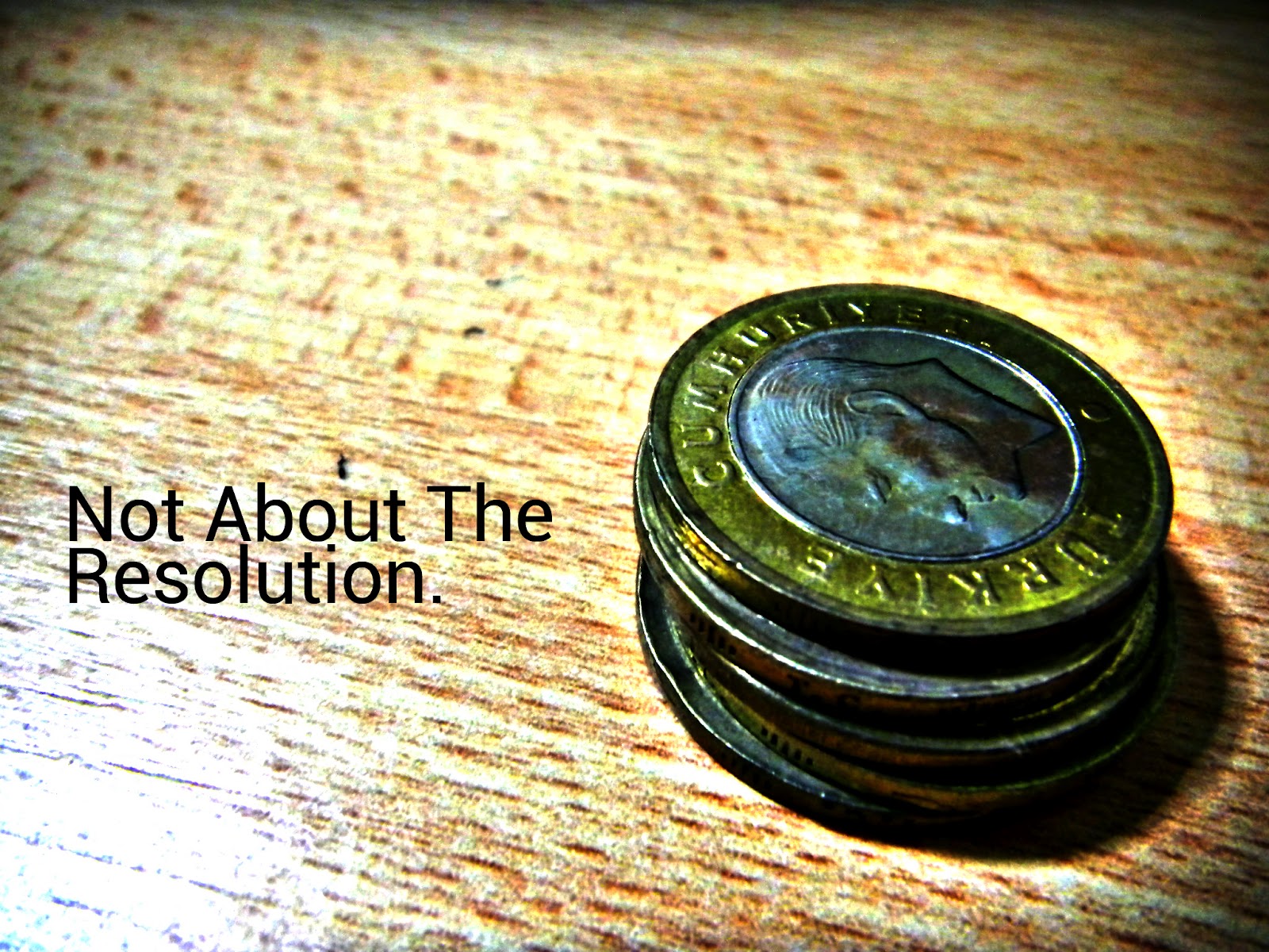
Original Photo: The colors in this photo are extremely muted due to the camera's compensation for background lighting. This causes the image to be dull an unappealing.
 Intense Colors: By intensifying the overall colors of the photos, we achieve the effect of filling up space. The detailing on the coins also become apparent through the increased contrast, making it more visually pleasing.
 Original Photo: This photo is rather neutral on the coloring and it composition is rather decent with most of the space filled. However, the viewer will lack a point to pay attention to. Hence, added blurring is needed.
Edited Photo: Firstly, I removed the shadow on the top of the picture which draws attention away from the subject. Next, I blurred out the surroundings of the brand label to increase the focus there. Finally, the colors were modified slightly for a more intense effect.

Saturday, November 5, 2011

[PowerPoint] Effective designs with photoshop

PowerPoint presentations are the standard visual aids for presentations in this technological age. The user-friendly, intuitive layout allows even the most inexperienced user to create slides with animations and transitions. However, it is an entirely different story when it comes to designing professional looking slides encapsulating all the information you want to relay. This simple run through demonstrates the power of a Photoshop-PowerPoint mash-up.
1. The cover slide
Like an introduction, the cover slide gives the first impression of your team, as well as the presentation to your viewers. Hence, it will not suffice to simply fill up the cover slide template Microsoft provides us with. In the example provided above, the emphasis is clearly on the name of the team. Also included are the team member's names, the name of my organisation as well as other information to placed at varying angles to give the presentation a dynamic feel. The logo also gives the viewer a graphical representation for a more lasting impression so that he can form a mental connection between the group and the organisation. Even though so much information is presented, the slide looks clean as only 3 colors are used. lighter shades are also employed so that the slides seen less cluttered, allowing the viewer to focus his attention on the key idea of the slide. The subtle reflection at the bottom of the slide reinforces the key idea.

2) Single object slide
A slide such as this has only 1 key topic, as well as the details that the presenter would like to inform the readers about. The list view in the default PowerPoint application does convey the point but large amounts of information would intimidate the viewer and make the slides seem cluttered at the same time. Yet again, we can employ the technique of dynamism by varying the angle of the text. Emphasis  and focus can be directed by changing the color scheme as well as the font size of the text. In the example above, the main object is seen in the largest font. Since the area that we are describing would be his traits, it is highlighted in red in a smaller font, making it the second object that the viewer focuses his attention on. These traits are also separated into physical and character traits. However, instead of explicitly stating such boundaries, we use variance to give the viewer the impression of separation. The character traits of the object in the example above are in a darker font and are tilted at a uniform angle. The physical traits are done in a slightly lighter font and categories such as "height" and "weight" are written in an even lighter font. This allows the reader to focus on the details while giving him ample information as to what he is reading about. This is done through the use of larger font sizes.


3) Multiple object slide
More often than not, one would have several different points branching into sub-points. However, presenting all your points on a single slide would be bombarding the viewer with too much information as he is only able to absorb a limited amount of information. The solution would be to unify these information by using a constant theme while allowing the viewer to make a mental connection between points by referencing or showing the viewer the links visually. The example above does just that. Each point is clearly marked through the use of a red square bracket. Within it, an acronym is placed to reinforce the memory of the viewer about the content of the box. The smaller text in the box provides details as the the viewer would want to know what these acronyms stand for. Elaboration is added to the bottom of the box. This stylistic enhancement to the default formatting allows the viewer to better remember the points and is clean throughout, removing the cluttered feel of content heavy presentations. The header of the topic is at the bottom left corner and is seen on all three slides, allowing the viewer to group all three ideas under the same umbrella term of "special abilities". Another technique used to unify would be to show the previous and next point in a slightly lower transparency so that the viewer can still make reference to the previous point while focusing his attention on the current one. This left to right scrolling also fits in nicely with some PowerPoint transitions such as wipe, creating the flow of the presentation.

For the slides, Photoshop or jpeg files, please feel free to contact me at kennethchow96@gmail.com

Sunday, September 4, 2011

Name Card Design

Hey guys, decided to upload my revolutionary name card on this blog. So how is it revolutionary? Think about it, how often is it that you see a nice name card with all the details that you might need on it? Too often, people who try to cram too much information on their name card find that the wording turns out crammed and many important details like the logo of the organisation is not large enough for the recipient. In order to solve this problem, I have enlarged the school crest such that it flows over the sides. However, it does not move the focus from the main text as the transparency is reduced. As the words "name card" suggest, the focus has to be on the name. As such, the largest and most distinct text would be my name. To make it stand out from the general card, white is used as it has the greatest contrast to the black backdrop. This if followed by the part I play on the team as the reader continues reading from the main focus. Noting the the target audience would be people from other countries, they would probably remember a person by their country and hence, the words team Singapore with Singapore in red. In case the person would like to contact me, I have also included details such as my email as well as my Facebook profile URL. In order to make the card look less wordy, the Facebook icon as well as a mail icon is used. This also makes the card more intuitive to read as the reader would immediately identify the location of my contact details instead of having to look through all the text like in conventional name cards. On the left, I have included the team name in green and white which is less outstanding than the main text, this will share the focus with the crest as it holds the same information, which is the school I represent. Beneath it would be the team credentials in grey, allowing the reader to gain some information about the team. Overall, the bulk of the information is centralized and hence stands out when viewed at a glance. Also, it conforms with the school colors of green, black, white and gold and also the national colors of red and white, all naturally colored on the information. This aids visual recognition and allows the reader to form a mental connection with the country as well as institution. However, this is just a draft. Please feel free to comment on it. Thanks!